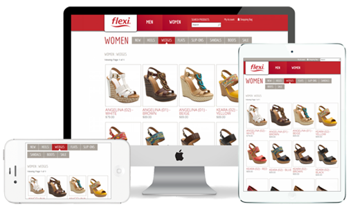
Responsive Design is a term used to describe websites that automatically sense and conform to a consumer's screen or device. The technology used to create responsive designed websites allow smaller displays, such as mobile phones and tablets, to receive a slimmed down version of the website; whereas visitors on larger screens, such as PCs, see a richer, fuller version.

With the rise of mobile devices such as smartphones and tablets, websites can no longer be competitive if they are not responsive. Consumers continue to use mobile devices to research and complete their online orders. We are also seeing shoppers use a variety of devices when placing orders on your website. Very often they will start the shopping process on their phone or tablet during the day, only to complete their order on their computer when they get home.
Google Analytics
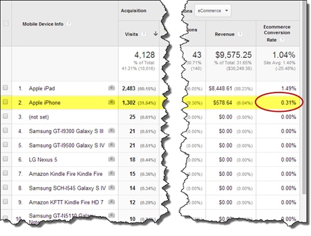
Using Google Analytics, it is easy to see how your shoppers are using your website and what devices they are using. You can also see how much each of these devices are converting, or not converting, on your website. Seeing a huge drop in your conversion rate on mobile devices means it is time to update your website design to it is responsive.
Additional Information
Here is a blog article we wrote on responsive design in January 2013:
Modern Retail recommends that every website be responsive because without it, you are at a huge disadvantage - your competitors are there and more importantly, so are your customers!
Please create a Support Request today if you are interested in upgrading your website so that it is responsive to consumers on mobile devices.